zeit:raum
Bach’s Brewery
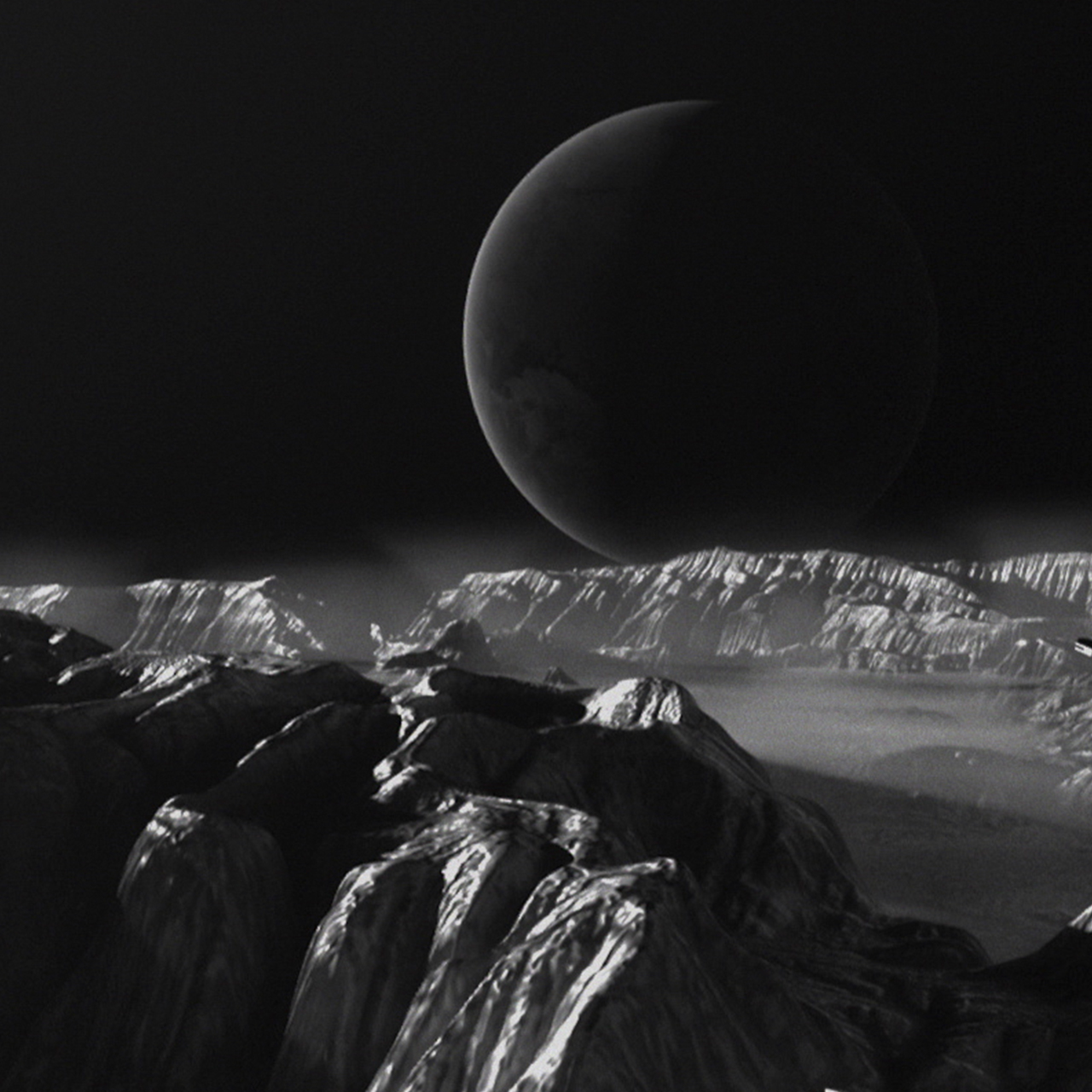
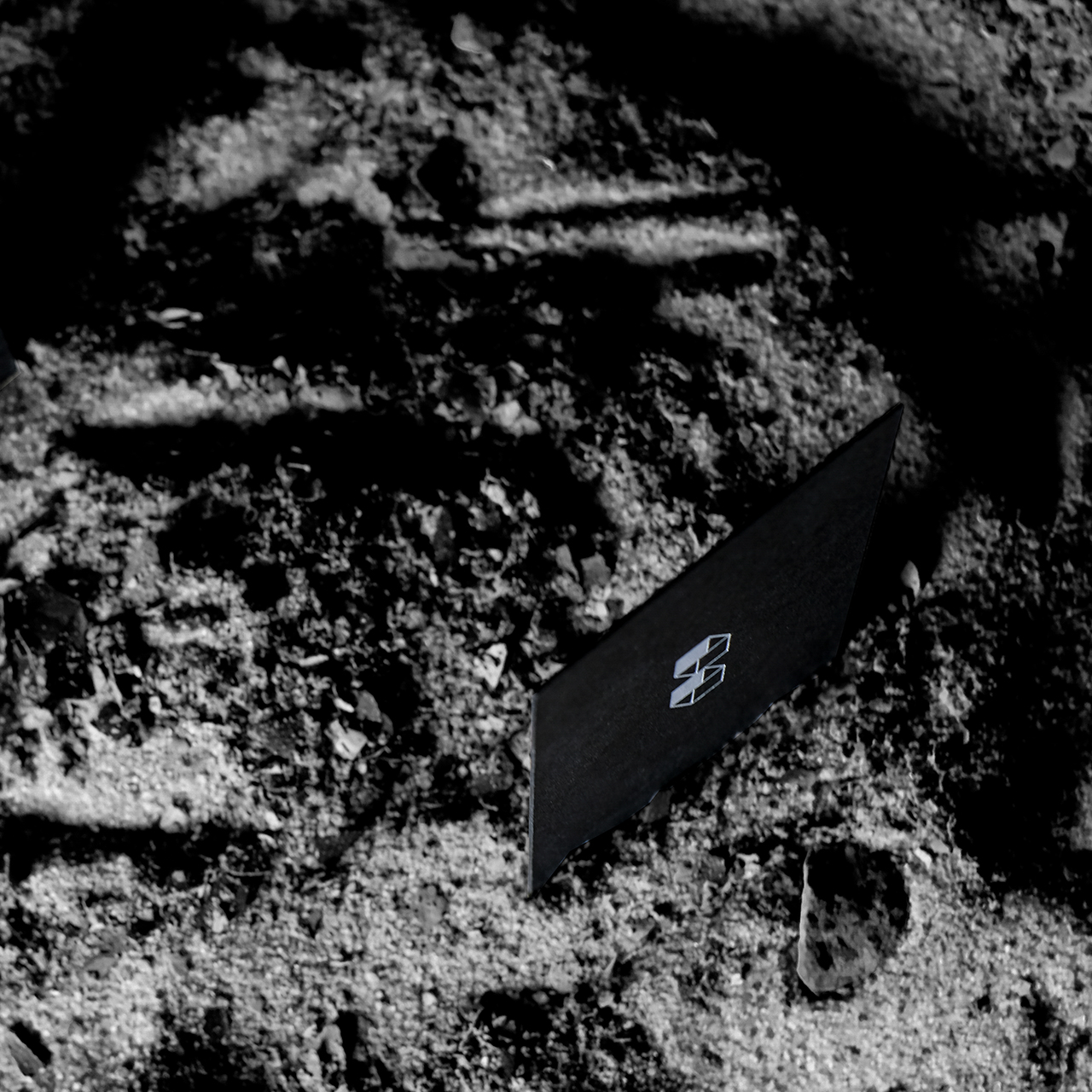
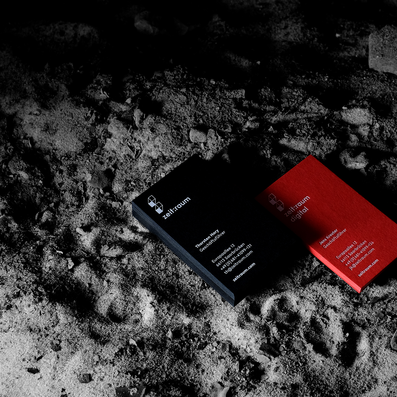
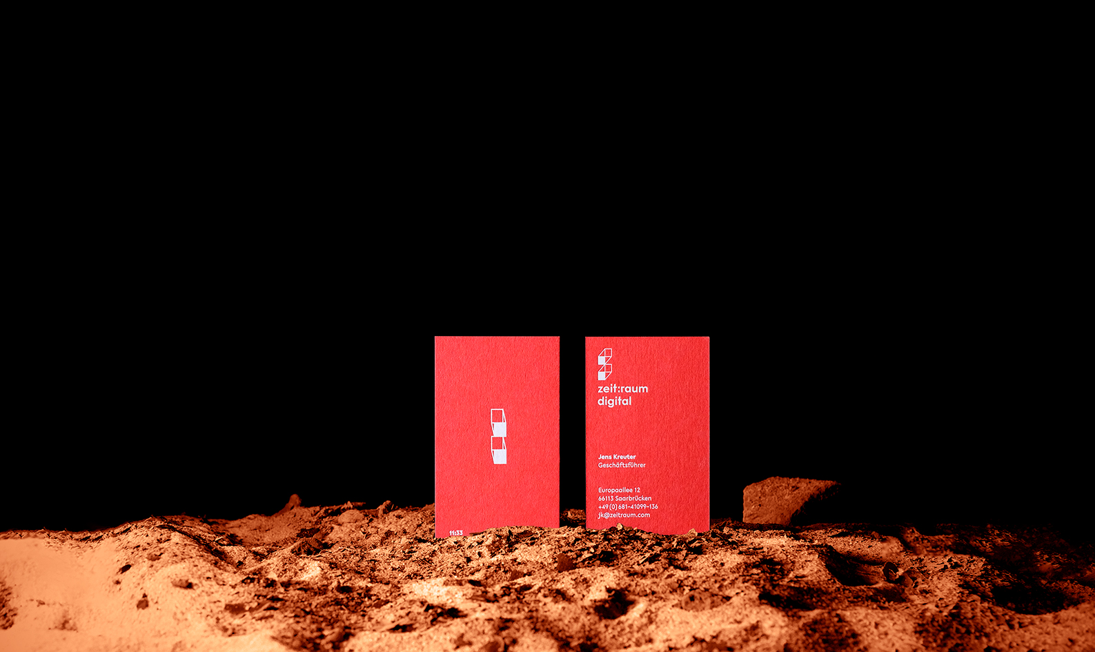
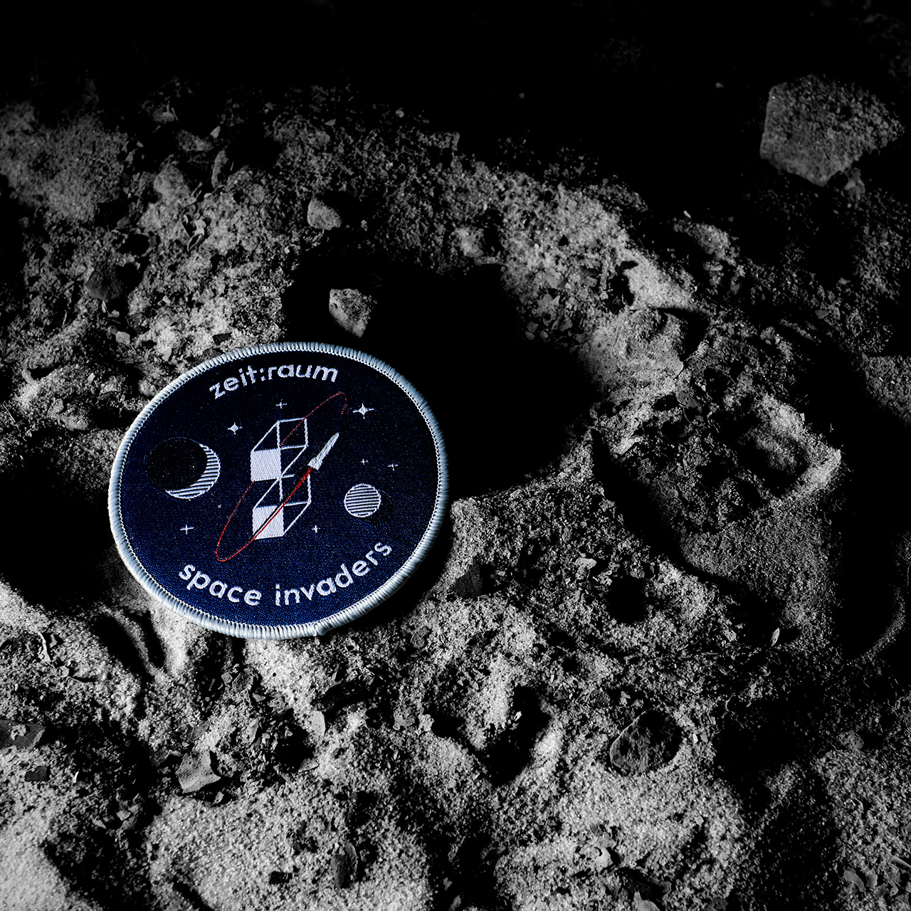
zeit:raum
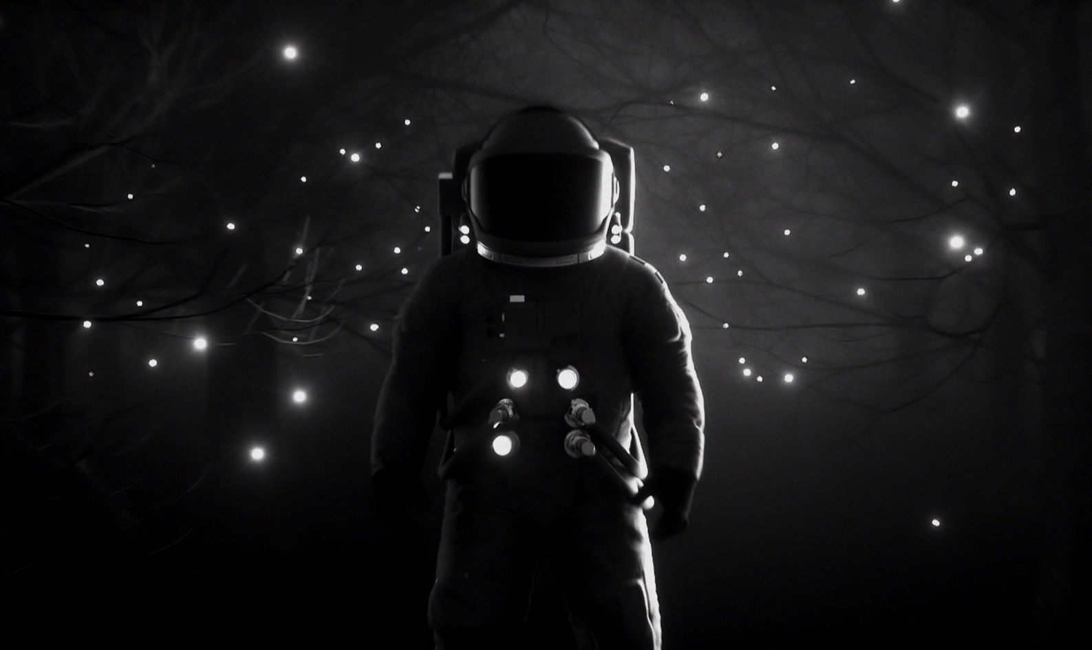
Corporate Design for the award winning film, vr/ar
and digital company zeit:raum.
Corporate Design and packaging for Bach’s, a small southern german brewery founded in 2009.
Delivering bars and festivals with their handcrafted beers, in 2018 they decided to go the next step and bring their sustainable range of beers to the retailers together with a new design.
Bottled. For the first time.
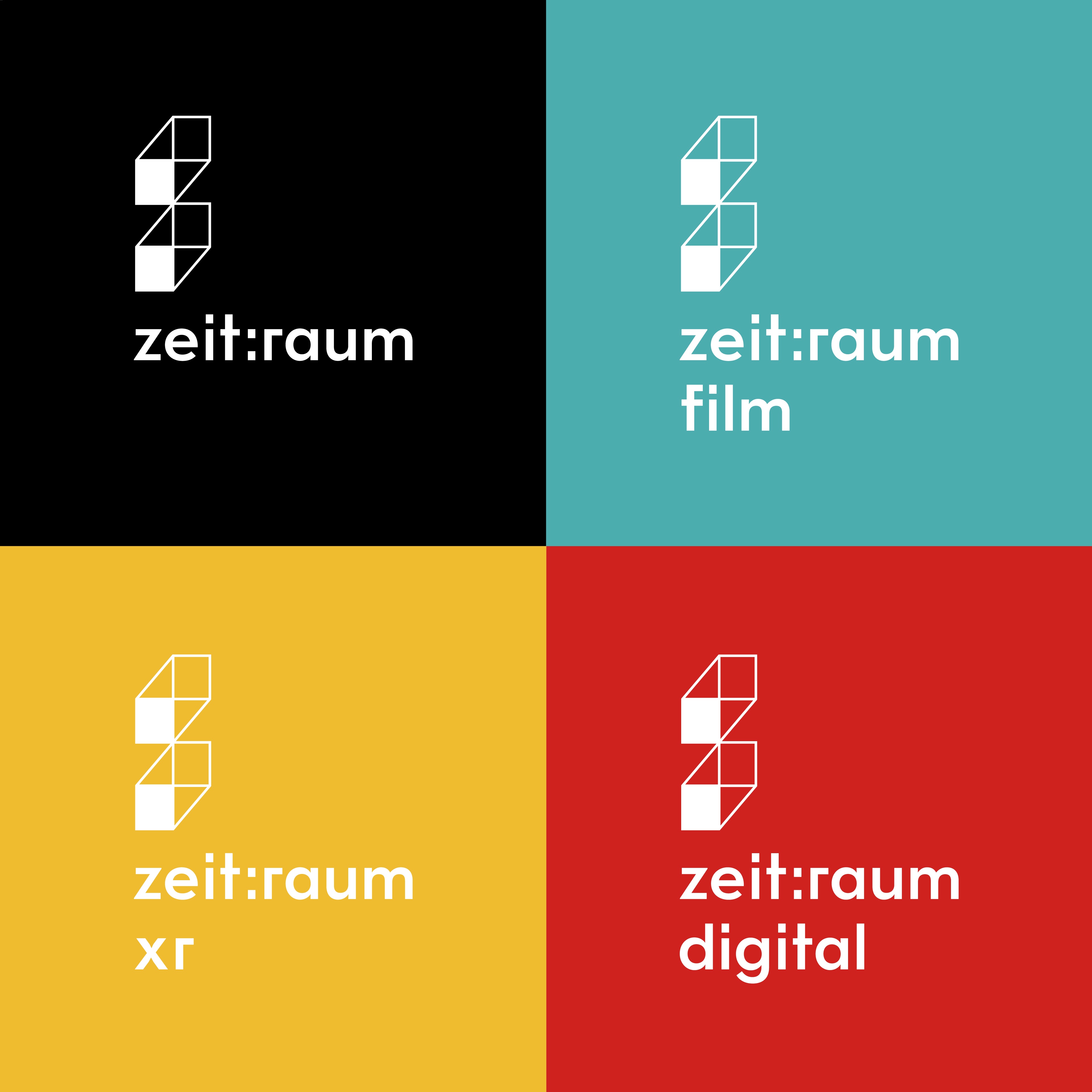
Corporate Design for the digital company zeit:raum film GmbH as well as their digital unit zeit:raum digital GmbH.
—
Corporate Design
Corporate Design
Branding
Branding
in collaboration with
Jono Garrett &
Daniela Spinelli
in collaboration with Jono Garrett & Daniela Spinelli
2018
2018
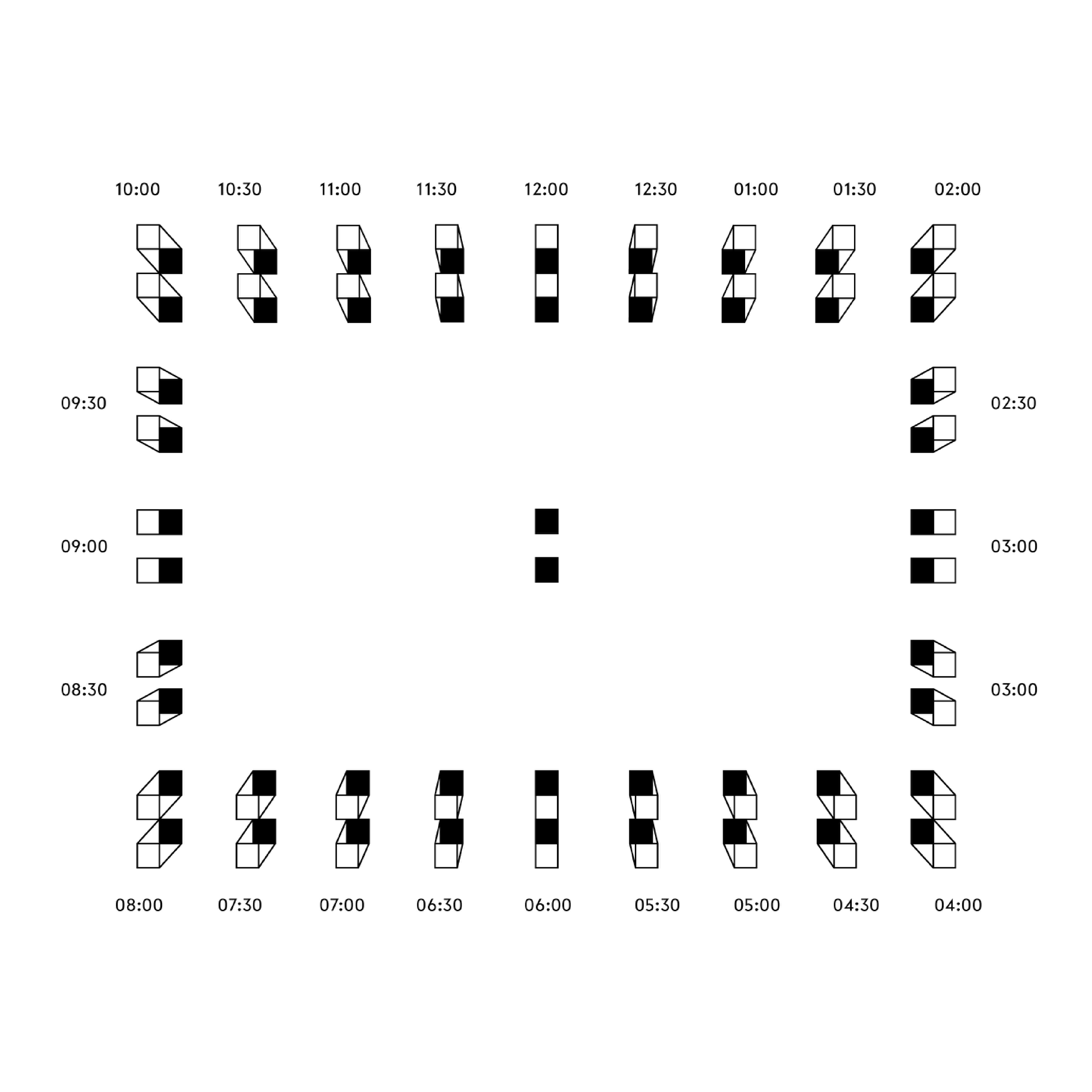
The colon relates to the digital watch and the extrusion symbolizes their work in the 3D field. The size of one dot is based on the dimension of the 35mm film and the total dimension of the hero logo is based on the size of the film projection in cinemascope.
The brief was simple. It should be classic, but not too much. Unique of course. Bold. Noticable. It should sneak a peek what’s inside. A hand-crafted premium beer.
The letter »B« as the new logo is based roughly on a minimalized version of blackletters to represent the beer history with a modern touch through the impossibles shapes happening in the logo itself. The new colour range with copper and a dark blue is inspired by the old brewing copper and the history of breweries in that region. In addition to the classic beers like »Hell« and »Pils« the colour range extends for seasonal beers e.g. their autumn-coloured »Dunkler Bock«. The pattern-shape around the logo —inspired by the shape of crown caps— is mirrored in the label die-cut and appears in their printed matters as well. Hotfoil finishes complete the »classic and modern« touch of the labels.
Bottoms up! Prost!
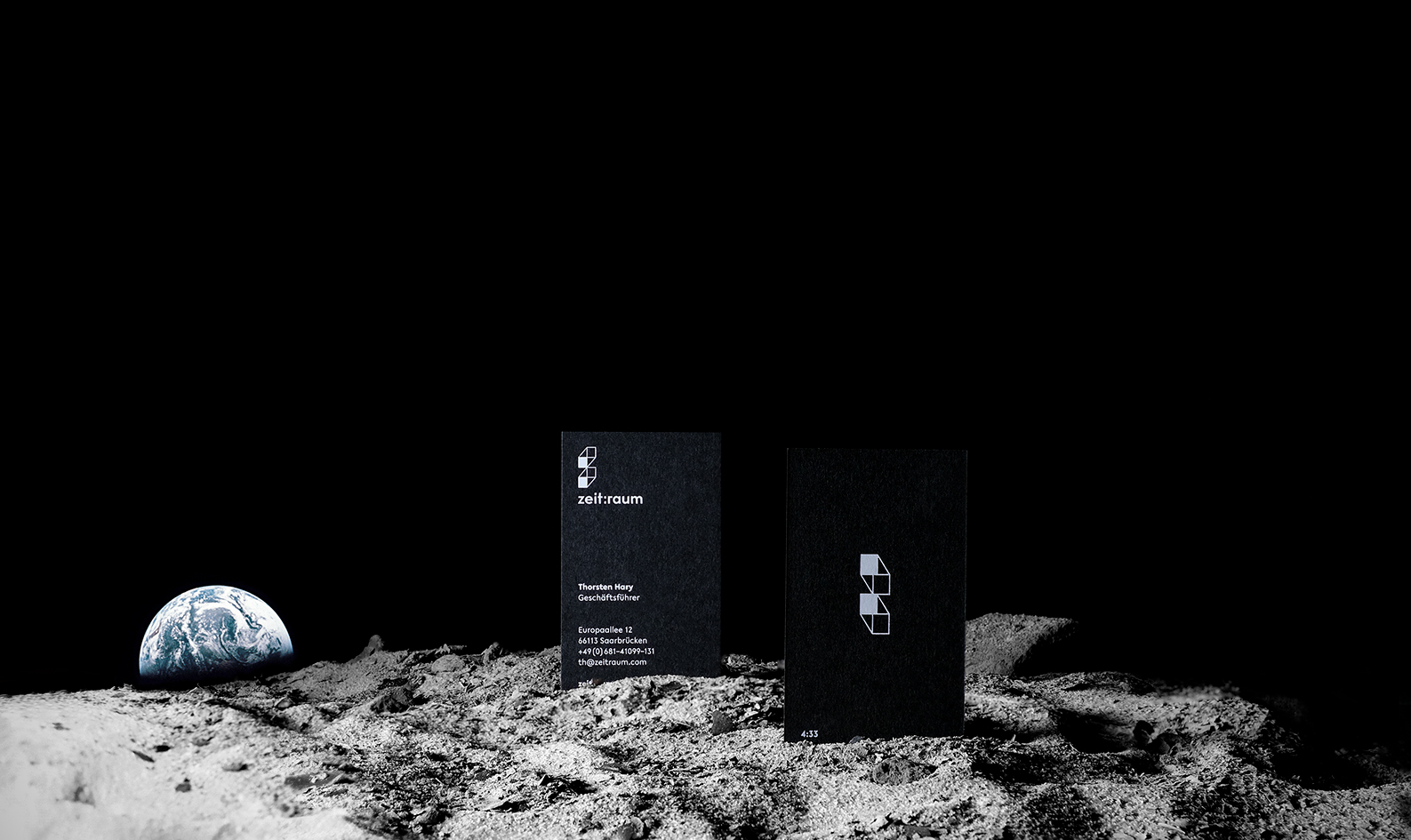
the dynamic logo, which moves like an analog clock, allow us to represent significant times in film history (Marty and Doc arrive in the future at 4:29pm) It was also used to depict important milestones on business cards, so that each employee had a personal story attached to their card.
The brief was simple. It should be classic, but not too much. Unique of course. Bold. Noticable. It should sneak a peek what’s inside. A hand-crafted premium beer.
The letter »B« as the new logo is based roughly on a minimalized version of blackletters to represent the beer history with a modern touch through the impossibles shapes happening in the logo itself. The new colour range with copper and a dark blue is inspired by the old brewing copper and the history of breweries in that region. In addition to the classic beers like »Hell« and »Pils« the colour range extends for seasonal beers e.g. their autumn-coloured »Dunkler Bock«. The pattern-shape around the logo —inspired by the shape of crown caps— is mirrored in the label die-cut and appears in their printed matters as well. Hotfoil finishes complete the »classic and modern« touch of the labels.
Bottoms up! Prost!
zeit:raum brand teaser by zeit:raum film GmbH.
zeit:raum »Wir bewegen Welten« by zeit:raum film GmbH.